No core component is available in react native for creating the custom radio button. If you want one, you need to look for the open-source community. You can install it using the npm package manager from react-native-radio-buttons-group. But this post is regarding creating your own custom radio buttons. So let’s see how you can do it. Basically, we will use some core components along with the icons provided by the Expo. In particular, we will use Ionicons icons provided by Expo vector icons. If you just want to run the code and see how it works then clone the git repository called react-native-radio-buttons.
Create React Native project and then a custom Radio Button component
Create a React Native app project. If you forgot how to create one then go through my previous post on “How to create the React Native App“. Once you create the project, create a directory at the root level called components. Inside it create a file called RadioButton.js. It will hold the single-item radio button along with the label.
RadioButton.js source code
import { Text, View, StyleSheet } from "react-native";
import { Ionicons } from "@expo/vector-icons";

function RadioButton({ children, selectedOption, setSelectedOption }) {
  return (
    <View style={styles.rootContainer}>
      <View style={styles.label}>
        <Text>{children}</Text>
      </View>
      <Ionicons
        name={
          selectedOption == children ? "radio-button-on" : "radio-button-off"
        }
        size={24}
        color="blue"
        onPress={() => {
          setSelectedOption(children);
        }}
      />
    </View>
  );
}

export default RadioButton;

const styles = StyleSheet.create({
  rootContainer: {
    flexDirection: "row",
    paddingVertical: 10,
  },
  label: {
    justifyContent: "center",
    alignItems: "center",
    paddingRight: 20,
  },
});
Let’s look inside the code. The RadioButton component accepts three props. The details about each prop are given below.
- children: It holds the name/label of the radio button
- selectedOption: It holds the state of which radio button is currently selected
- setSelectedOption: It is the function that sets the selectedOption state
Another thing to consider is the <Ionicons /> component. It has four properties namely the name, size, color, and onPress event. The important thing to consider is the name of the icon and the onPress event. You will see if the selectedOption is the current value of children then we are setting the icon name to “radio-button-on” or else “radio-button-off”. Take note of the name, it should have the name supported by the Ionicons, more about the different types of supported names can be found in the Expo vector icons. If the user clicks on one of the radio button icons then we are triggering the setSeletedOption event handler, which will change the selectedOption state. Accordingly, it will re-render the UI since selectedOption is the state variable.
How to use the RadioButton component in your App
Since this app just displays the radio buttons, I will make use of a custom radio button in the App.js file. In your case, you might use it wherever you want it. The App.js file will look like the one given below.
App.js source code
import { StatusBar } from "expo-status-bar";
import { StyleSheet, View } from "react-native";
import RadioButton from "./components/RadioButton";
import { useState } from "react";
export default function App() {
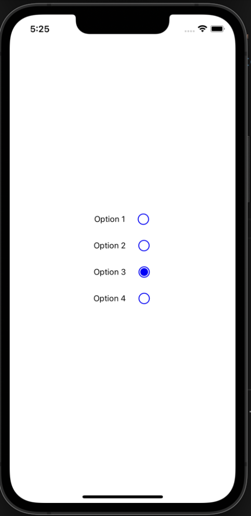
const radioButtonOptions = ["Option 1", "Option 2", "Option 3", "Option 4"];
const [selectedOption, setSelectedOption] = useState(radioButtonOptions[0]);
return (
<View style={styles.container}>
<StatusBar style="auto" />
{radioButtonOptions.map((singleOption) => (
<RadioButton
key={singleOption}
selectedOption={selectedOption}
setSelectedOption={setSelectedOption}
>
{singleOption}
</RadioButton>
))}
</View>
);
}
const styles = StyleSheet.create({
container: {
flex: 1,
backgroundColor: "#fff",
alignItems: "center",
justifyContent: "center",
},
});
In the App.js file, you will see there is a local variable called radioButtonOptions. It will hold the name of the radio buttons. This is the place where you can modify the name of the radio buttons if you want to use them. Basically, this is the value of children that the RadioButton component accepts as one of the props. Next are the state variable selectedOption and the function setSelectedOption to set the value of selectedOption. The reason behind declaring the radioButtonOptions, selectedOption, and setSelectedOption in App.js file is that you might want to have the value available in App.js file or wherever you used the RadioButton component(parent component), and another reason is that we want to make RadioButton as a reusable component. Otherwise, you can declare it inside the RadioButton component itself. By default, “Option 1” would be selected and assigned to selectedOption state variable.
Another thing to consider is the way you use the custom RadioButton components. You can see that I am iterating over the radioButtonOptions list, you have the pass key props for the RadioButton component. Since we expect to have a unique name for the radio button, it can be used as the key’s value. The props name of the RadioButton component should be selectedOption and setSelectedOption, you can not rename it to other names. As we have destructured it in the RadioButton component. If you want to rename it then you have to change it in the RadioButton component as well. Finally, the RadioButton component is having a separate closing tag because we expect the name of RadioButton to pass as children to it.
Conclusion
To conclude, we created the custom radio button using the react native core components like View and Text along with the Expo vector icons components called Ionicons. Further, we made use of StyleSheet API for giving style to the UI of our radio buttons.

I am an enthusiastic tech guy. Ever ready to learn new technology. I love building software solutions that can help mankind to solve problems.
You can support us by:
- Becoming a patron at https://www.patreon.com/drukinfotech
- Buy me coffee at https://www.buymeacoffee.com/drukinfotech